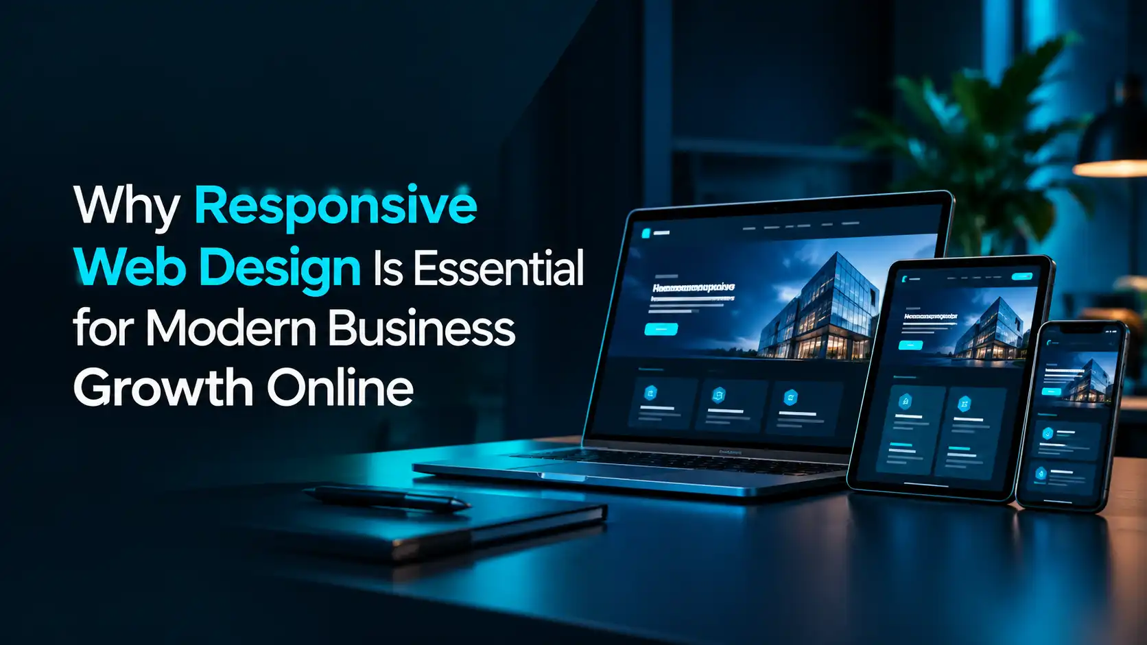
Websites are no longer viewed just on desktop computers. Today, people browse the internet using smartphones, tablets, laptops, and even smart TVs. If your website looks great on a monitor but breaks on a phone screen, you are instantly losing potential customers. This is where Responsive Web Design (RWD) becomes a necessity, not an option.
Responsive web design ensures that a website automatically adjusts its layout, images, and visual elements to fit any screen size seamlessly. Here is why investing in modern web design is vital for your digital success:
- Delivers a Better User Experience (UX): Nobody likes zooming in to read text or hunting for hidden navigation buttons. A flexible layout offers effortless scrolling, readable fonts, and fast navigation, keeping visitors engaged much longer.
- Boosts SEO and Search Engine Rankings: Search engines prioritize mobile-friendly websites. Search engines evaluate the mobile version of your content first when indexing and ranking pages. A non-responsive site actively hurts your search visibility.
- Drives Higher Conversion Rates: A smooth user journey builds trust instantly. When visitors can easily browse products or fill out contact forms on their mobile devices, they are far more likely to buy or inquire.
- Saves Time and Money: Managing two separate websites—one for desktop and one for mobile—requires double the effort, content management, and hosting costs. A single flexible site keeps your management efficient and budget-friendly.
- Faster Page Loading Speed: Responsive frameworks utilize optimized images and modern code structures, helping your site load quickly across mobile networks.
Your website serves as the digital front door to your business. By adopting a mobile-first approach, you deliver a polished, consistent experience that keeps visitors coming back, protects your search rankings, and directly supports business expansion.